Archives for September 2006

Leave Your Comments Open!

Okay, I've seen way too many blogs requiring some kind of registration before you can leave a comment, and I think it's about time I let you know my opinion on this.

I hate it when people require you to register. Unless it's some kind of really busy and popular blog with a proven successful track and long history, there is absolutely no justification whatsoever to make people register just because they want to comment on one of your posts.

To me, low-traffic blogs with required registration or completely closed comments, immediately mean one of the two things about their owners:


  1. Blog owner wants to get something from me for my chance to do him/her a favor

    Naturally, many blog owners have some goals to pursuit. That's totally cool with me, as long as their goals don't enforce anything upon me. For example, I don't mind nicely integrated ads – I understand the desire of a blogger to earn some cash from his online creation, and I respect it. He (usually) doesn't beg me to click on a banner, and he doesn't hide any potentially useful content under the "click me" or "give me your email" page. I have a choice. I feel respected, because I can decide myself whether I want to click somewhere or not.

    And when I see an interesting post and I have some useful information to add, I'm really pleased to see an indicator of open comments – like a number of comments left so far, etc. But when I click the link to leave a comment and see a message asking me to register, I immediately realize: the blogger asks for too much. He may get it from someone else, but not from me.You see, comments are adding value to his blog. By leaving comments, people share their opinion, ask questions and interact in all other possible ways.

    Without comments, a blog looks strange. So, in effect, you're doing the owner of a blog a favor by leaving your comments. So he should be open and grateful to such favors.If, instead, the owner wants me to register – to pick a username and to provide one of my working emails, this immediately makes it obvious that the owner doesn't respect his visitors and commenters at all.

    It is plain wrong to make people give you something personal (like an email) for a chance to do you a favor.If you have been this kind of blogger so far, change your tactics immediately cause you now understand why you are wrong! It's better to disable comments completely than leave them seemingly open but then ask for a registration.

  2. Blog owner is being ignorant and/or lazy

    This is another popular type of blogs and their owners. Many bloggers justify shutting their comments down by mentioning potential spam attacks and overwhelming efforts it's going to take to maintain clean comments and make sure no spam is allowed.

    While this is a serious and quite real problem for many bloggers, there is a number of solutions available, and you don't have to be a rocket scientist to make them work:

    Captchas

    This is the most common way of protecting yourself from spam. Your blog automatically shows some image representing a textual information, and asks commenter for a confirmation of what is shown there.The logic behind this is that most spam is automatic. So if it's a spam bot, it will not likely "see" the textual information on the image, and won't be able to confirm it.

    For human commenters, though, it's going to be quite easy to look at an image and type what they see in a separate field. Thus confirming the human nature of a comment and raising the possibility of a comment to be a real thing and a genuinely useful information.

    Captchas usually show letters in different colours and shapes, so it's fairly hard to automate the recognition of letters on such images. For people it's still quite easy to do this, so captchas are very common and effective.

    Spam word filters

    Looking at spam comments left on your blog, you can probably see the nature of most of them and spot words which contradict the topic of your blog so much that it would be safe to make an association: if a comment contains some specific word, it's likely to be a spam and should not be shown on your pages.

    Many blog engines support such filters and allow you to greatly reduce the number of spam post which get through.

    Automatic spam filters

    One word: Akismet. Speaking of spam protection, this is the greatest thing since sliced bread.

    Akismet is a centralized spam filter, and online engine which allows you to use its vast knowledge base to effectively filter out spam comments.

    You use it by installing a plugin for your blog engine and entering an Akismet API key (get one free at WordPress.com after you sign up for an account there), and it automatically and – very important! – discreetly analyzes all the comments left on your blog, and marks spam ones for your later review. Whenever you log into your administration panel next time, you can see right away how many possible spam posts have been filtered out since your last session.

    I like Akismet a lot, I use it for all my blogs and I enjoy lots of spam filtered out daily on an automatic basis – I hardly do anything about this spam. I log in, glance throgh all the spam, and click the "Delete all" button. That's it! Incredibly useful.

    That being said, your mileage may vary ;) I hear, some people don't like Akismet at all. Oh well, I'm sure they have some alternatives then ;)

 
Valid reasons for closing comments

Like I said at the very top of this article, I get the above mentioned negative impressions ONLY when I see comments turned off on a low-traffic, unpopular blog. But my attitude towards major blogs with comments disabled is different, simply because there is always a chance of them having a genuine valid reason for closing comments. 


Here  are just a few valid reasons for you to close your comments:

  • You are a very popular and busy resource,  and you get lots  of human spam

    This means that automatic ways of spam protection may not be effective enough to save your precious time. If that is the case, a popular enough blog may be throwing hundreds of comments at you daily, and unless the majority of them are valid and valuable opinions, you will likely to just disable comments all together and apologize for this in one of your posts, explaining the situation

  • Your online resource is more than just a blog, and you want visitors to have better ways of exchanging ideas

    This implies that you have a dedicated discussion board setup, where you invite all your visitors to comment on your posts. There are various approaches here, but it's quite popular for large sites to post an article on their blog, and then automatically create a forum discussion thread for any comments.

    Of course, you're going to hit the same spam problems with discussion boards, but the clear advantage of having it separate is that your original content is going to be separate from comments and therefore any comments on your discussion board will not be directly associated with your articles.

  • Your blog is a collective effort, and you encourage people join the community and participate in commenting and article writing

    Again, this is quite a possible scenario – I've seen it few times and it works just fine. But it is very important to highlight such a nature of your resource and make it easy enough for new users to join.

    Encouraging people to join should really go beyond a "Want to leave a comment – give me your email" invitation. Be creative! There's got to be something you can do in return – something people will benefit from by joining your community.

    It could be access to members area of your website or an individual profile page on your website they can link to – but there's got to be something your community members find interesting and valuable to them, if you want them to participate.

  • Your blog is content-oriented, and you're so popular and so good that you have to disable comments to save time for writing

    Believe it or not, this case is as probable and as common as any others – almost every day I notice another promising resource with great content, and some blogs are so popular that it's very easy to believe the choice between answering comments or posting new quality articles is not an easy one.

    If you have some definite indicators that people love your content (many incoming links, solid traffic and thousands of visitors a day), and you notice yourself spending more and more time sorting your email out, it is a decision you're eventually going to have to make – either keep communicating to everyone who leaves a comment, or close your comments and instead concentrate on providing more of the great articles everyone keeps coming back to your blog for.

That's about it. I've been working on this article for a few days, and there's just too many thoughts on the subject.

The message I wanted to give you all is this: leave your comments open unless you have a valid reason for not doing so.  
How To Improve Your Blog Usability And Why You Want To Do It

Usability of your blog is one of the most important factors of how successful and popular it is. Yet, it is often neglected.

Read on to find reasons and motivation for improving the usability of your blog, and once you feel totally convinced, I'll show you some of the best tips to greatly improve your situation, listed along with instructions and links to respective online resources.

What is usability?

Speaking of web, usability is a term used for showing how easy (or hard) it is for your visitors to browse your online resource. Usability applies to all kinds of online resources: it can be a regular website, an electronic library or a personal blog – it doesn't really matter. What matters though is how easy it is for people to move around your collection of resources, and how comfortable you make this experience for them.

In general, usability indicates just how easy it is for people to use a particular tool in order to achieve a certain result. When you project it into the world of blogging, this makes your blog a tool. It is both a tool for you to share the information and for users to receive it. So improving your usability means making both primary uses of your blog a pleasant experience.


Why improve usability at all?

With millions of blogs updated daily, the pressure is growing every day for every one of us to raise the standards of our blogging. Demanding visitors expect increasingly more, and this means that the basic level of usability has to be maintained by every blog, including yours.

Unless you're a selfish genius who writes posts for himself, you would really want to make sure your visitors get what they expect to see when they arrive at your blog, and it's therefore absolutely vital to make them feel comfortable browsing your pages. Especially so, if you hope for some of them to come back to your blog again and again.


How To Improve Your Blog Usability

As with anything else, in order to improve your blog usability you need to find out reasons for doing so. After you understand all the reasons, you can focus on one particularly beneficial usability feature or another. Essentially, you want to define and write down the following:

  1. Your purpose for having a blog

    Why do you blog, really? What are the main goals you have? What is the purpose of your blog?

    You need to ask yourself all these questions to have eventually a list of pretty general goals of your blog, and make sure you can align your blog usability against such a list.

    Here are just a few examples of how you would align your usability improvements against your blogging goals.

    If your blogging goals are:

    • to provide visitors with useful information
    • to develop your skills and knowledge in relevant subjects
    • to gain more readership
    • to participate in blogging community

    …then your usability improvements should be respectively aimed at:

    • both increasing and simplifying ways to access information on your blog pages
    • encouraging your readers to leave comments and provide feedback
    • providing multiple means of reading your blog regularly – RSS feeds and email subscriptions
    • making sure you link to other blogs and get them to link to you
  2. Purposes your visitors might (should) have

    Why should anyone want to read your blog? What would your regular readers keep coming back for? What would a first-time visitor notice or discover first? What would your visitors be looking for?

    These questions are aimed to help you understand what kind of the first impression your blog is going to make. Imagine yourself to be a visitor to your blog. Open it up in your browser and look closely – what do you see first? Is this an important piece of information or just an accidentally highlighted design feature which bears no value?

    Again, here is a list of most obvious reasons you might have:

    • your blog contains genuinely interesting information of educational nature
    • you're an expert in your field, and visitors will come back for more information
    • your visitors are likely to be so interested that they will want to browse your previous articles
    • you are so brilliant that some people will want to read your blog regularly

    And they would mean the following directions in your usability enhancement:

    • highlighting the most recent information, notifying blog search sites about new posts
    • showing a list of most recent posts to make navigation easier
    • providing links to monthly archives of your posts and list of categories of posts
    • making RSS and email subscription options visible


Technical details 

Now that I've got you interested in usability enhancements, I offer you the following list of WordPress articles and plugins which I believe you will find useful:

  1. Blog posts archives pages
    It is very important that you give your visitors an option to access every previous post of yours with just a few clicks. Blog archives pages serve this very purpose.

    Consider using Justin Blanton's Smart Archives plugin, which will provide you with a very quick and effective way of showing your blog archives – with monthly sections and links to every individual post of each month.

    To see this in action, check out Perfect Blogger Archives page.

  2. Category lists

    Most themes for your blog would have a built-in and probably enabled by default functionality of showing a list of your categories somewhere on a sidebar.

    One of the easiest way to increase usability of such lists is to provide a total number of posts found in each of the categories. This will make it easier for your visitors to decide what category to read next, by helping them realize what categories of yours have most posts.

    To achieve this effect (you can probably notice how it looks right here on this blog), you need to use the list_cats function of WordPress:

    <?php list_cats(FALSE, '', 'name',
                            'asc', '', TRUE, FALSE,
                            TRUE, true, FALSE,
                            TRUE, FALSE, '', FALSE,
                            '', '', '',
                            TRue); ?>

  3. Tag cloud
    This is a brilliant way to improve usability of your blog. Effectively, you will allow visitors to pick only specific topics of their interest as oppose to limiting them by your own list of categories.

    Tags are more specific than categories by their nature, so don't be surprised to end up with a long list of tags in your tag cloud.

    The idea of tag cloud is that it's going to highlight (using different font sizes) the most popular tags of yours (the once set for most number of posts), once again highlighting the most talked about topics of yours. The working example is found on this very site on the left sidebar.

    Ultimate Tag Warrior is the best plugin for this purpose. It's rather complicated, but well worth the time it requires to be properly setup.

    If you prefer doing everything yourself, you might like this Building A Tag Cloud in WordPress article.

  4. Blog feeds
    When people like your blog, they usually want to read it regularly. And since the easiest way to do this is by receiving your blog feeds, there is definitely something you can do to make their life easier.First of all, make your feed button (or text link) visible.

    Don't expect people open up a separate window with HTML code of your blog to find the feed link manually (although that's exactly what I do for far too many blogs simply because it's impossible to find their feed button on the page). Most people won't be like me, they will just wonder where your feed subscription might be, decide to come back to your blog, and eventually forget to do it.

    A bright visible feed button is the least you can do for your future readers.

    Another usability improvement here is to install a Feedburner Feed Replacement plugin and get all the various formats of feeds (RSS is only one of them) redirected to your one and only public feed, which you need to configure at FeedBurner.

    Setting your FeedBurner account is easy enough, and having a single blog feed will make your life easier in many ways: not only will FeedBurner automatically show the feed in expected by a client program format (for instance, your feed aggregator might expect your feed in Atom, RSS or RSS 2.0 format, or it could be just a regular browser opening the feed URL – FeedBurner will show a nice looking page with your posts in this case), and most importantly it will allow you to effortlessly track your readership.

    Open this page in your browser to see my FeedBurner feed in HTML: PerfectBlogger.

  5. Comments on your blog

    There is a whole array of various plugins to make your comments management and representation better for you and your readers.

    I suggest you explore the Comments Plugins section on the WordPress development site.

    You can also benefit from reading the Editing your blog comments article by Lorelle on WordPress.

  6. Related posts

    This is another great way of improving usability of your blog.
    By interlinking (providing links to relevant posts of your own blog), you will make visitors stay longer on your blog. You will also help them explore more on the topic of their interest.

    I prefer specifying relevant topics myself, and for this purpose I suggest you use a Terong Related Posts plugin. It simply adds a link to your post editing window in WordPress, and allows you to select the relevant posts from a global list of all the posts. Selected posts will then be given as a neat list of links at the bottom of your post.

    If you would like relevant posts to be identified automatically, you should have a look at a Related Entries plugin by W.A.S.A.B.I. then.


External links

You should find these resources interesting and relevant to this article:

Linkbaiting Roundup

Linkbaiting seems to become a hot topic once again. Having enjoyed reading quite a number of really interesting posts on the topic in the last few days, I thought you would benefit from looking through them.


So here it is, the linkbaiting roundup for you: 


This should be enough to get you started, and if you come across another useful article or two, please let me know! In the meantime, I'll probably get busy creating a Blogging Glossary entry for linkbaiting.

Challenges of Your Blog Comments

I just have to share this link with you! Lorelle VanFossen from the Lorelle on WordPress blog has just posted a great article on editing your blog comments.

The important lesson you can learn from this article is that comments on your blog, even left by visitors, are still associated with your blog. It is therefore in your own interest to make sure these comments look their best and bring the clear message across to other visitors and readers of yours. 

Lorelle seems to have covered every reason you may want to edit a comment for, and she also has thoughtfully given you tips on how to deal with certain situations like moving a comment to a new location in the most elegant way.

Truly, an excellent article I suggest you all read: Editing Your Blog Comments.

Dark Room

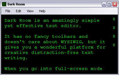
I've just added Dark Room to the Blogging Tools/Editors section on this site. Dark Room is an amazingly simple yet effective text editor.

It has no fancy toolbars and doesn't care about WYSIWIG, but it gives you a wonderful platform for creative distraction-free text writing. 

Here is how a typical session in Dark Room looks like:


Link to this editor page on Perfect Blogger: Dark Room

Internet Explorer in your Firefox Tab: IE Tab

I've been a Firefox fan since the early versions of this wonderful browser, and while I absolutely love most of its features, what it really lacked all the time is a set of Internet Explorer-only features some really stubborn websites still require. I found my way around most of such limitations, but after I joined my current company I had to suddenly start using lots of ActiveX-powered websites, and this meant having a whole set of pages I would browse in IE only…

Well, not anymore! Meet IE Tab – a wonderful Firefox extension which allows you to transparently open IE-only websites in a separate tab of your browser. All you do is maintain a list of websites which will always be rendered using the IE engine and not the Firefox one, and that's it. This list is accessible from the IE Tab options menu. I dare you – go on and give it a try: IE Tab.

Google AdSense: How To Show Search Results On Your Own Page

While opening Google AdSense search results  within your own site is definitely not new, I haven't seen any quick review explaining how it all works and what's required to set it up. Working on enabling this AdSense feature for my Personal Development blog, I figured someone else could find this post useful.


Introduction

Why would you want to show Google search results on your own page? To make sure your visitors enjoy the same interface the rest of your website has, of course. To ensure the design integration makes visitors feel as if they're browsing just another one of your pages.

Everyone who had used Google AdSense for search feature in the past, must remember that you had only an option to change some basic colors for the results block, and it would be opened from Google's website and usually look very different from the rest of your website.

Well, now we have an option to change this.


How it works 

The idea behind showing your Google search results on your own site is pretty simple. You've got to set up a designated search results page on your site. You're free to change any design feature of this page to make sure it looks as good as any other page of your website, but space for the Google search results must be reserved.

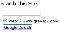
Instead of one piece of Google AdSense code, you're going to get two. The first piece of code is the one creating a Google search form for your website. Something which will look like this:


Google AdSense search form


The second piece of code is for your results page. Just copy & paste the search results code from your Google Adsense to your search results page,  and you're done. If you open such a page manually, without being called by Google AdSense search form, you will see no search results, but if the page is shown as the result of an actual search using the Google search form on your website, you will see a neat page with all the results found and nicely integrated in your design.


Step-by-step instructions

I don't intend this page to be a full manual on the Google AdSense search results integration by any means, but all the steps shown before will hopefully show you how easy the whole procedure is. 


1) Google AdSense account – you must have a valid AdSense account to begin with. If you still haven't got one, it's not too late to get one – you will find all the details in my Getting Started with Google AdSense article.


2) Find out the URL of your future results page 

You need to know where you results page is going to be found, because you will be asked for this URL in during AdSense for search setup.

For WordPress-based blog, it is fairly simple to specify the exact name of your page and therefore know the full URL for this page without even creating it (you can't created it yet, read on to find out why)


3) AdSense for search setup 

Log into your AdSense account, open the AdSense Setup tab,  click the AdSense for search, and configure your Google AdSense search in a way similar to this:

  • Search Type section – this is where you decide what kind of search you would like to provide your visitors with. Most likely, you will opt for a Google WebSearch + SiteSearch, as it allows both global and local (your domain-specific) searches.

    Click the radio button for the desired option, and if you opted for the SiteSearch option, type your website's URL in the form provided.

  • Search box style section – this dialog allows you configure the way your Google search form will look on your website
  • More options section is the one where you need to choose the preferred way of  Opening of search results page. If you click the  Open results within my own site radio button there, you will be prompted for a URL of your search results page from Step 2 of this how-to.

Complete all the rest options like you normally would, and the last step of your AdSense for search setup will be the two pieces of code I have mentioned before, ready for you to copy and paste into your website pages. 


4) Create a designated search results page for your website

Now that you have the necessary pieces of code in your AdSense setup window, would be a good time to create the results page of yours.

If you're a blogger, then you need to create a static page of some kind and make it look the same way you'd like it to be, leaving space to be populated with search results. 

If your blog is WordPress-based, you will need to create a page template, and then create a new page based on this template. You can find all the necessary information on working with Pages in WordPress on the Pages section of official WordPress documentation site. 

Essentially, a page template in WordPress is nothing but an PHP/HTML file you create in your WordPress theme directory. Take one of the existing page templates to start off, and make sure you paste the second piece of AdSense search code  into this page template where you would like to see your search results.


5) Update your website to include the latest AdSense code for the search form. This is where you decide what page of your website (or pages if it's your blog – cause many bloggers put search forms in the sidebar code, so that the search form is shown on practically every page of their blog.


That's all, you're done. Enjoy your new Google AdSense search results page!

If you're looking for a working example, please visit my Personal Development blog, and use the search form found on the right  sidebar. If you want to compare my search results page to the same page opened manually, you can always open the search results page yourself (like I mentioned before, you will obviously see no results in this case).

Let me know if you need help with getting this AdSense feature working on your website – just a leave a comment for this post, and I'll be sure to contact you using the email provided.

Also, I think you would benefit from reading the official AdSense support article on the same topic: How do I implement Adsense for search results on my own page?
 

Archives page added

I've just added a PerfectBlogger Archives page, where you'll be able to find every post I've made on this blog.


Archives page is one of the basic pages each blog should have. Not only does it help your visitors navigate around your older posts, but it also servers SEO purposes: it helps search engines get to each of your pages with content the quickest way.

If your WordPress theme doesn't come with a built-in archives feature, or if you don't like it for some reason, I strongly suggest you download and install the SmartArchives plugin by Justin Blanton

Glossary Updates in the left menu

A very quick update today: just like I promised a few days ago, I've added a Glossary Updates section to the left menu, it now shows the 10 most recently added or updated Blogging Glossary articles, and also shows you the total number of definitions found in the glossary. 

3 Ways to Make Old Extensions Compatible with Firefox 2.0

Digg This Story!

WELCOME, dear visitors! I would like to thank you for stopping by. Should you find this article useful, please share the link to my website with anyone who you think will benefit by reading it and subscribe to my RSS feed. THANKS!

So, I’ve had some more time to play with the latest build of Firefox, and I liked it so much that I couldn’t use the 1.5 version anymore. And this left me with a problem: hardly any of my extensions were compatible with the latest and greatest Firefox version.

I’ve made a bit of a research out of it, and here we are: I present you with the 3 ways to make extensions compatible with Firefox 2.0.

Firefox Books

If you like Firefox, you will find the following books extremely useful:

First though, I’d like to give you a few warnings:

  • not 100% of your extensions will work,some of the older ones would really be incompatible. But if you had Firefox 1.5, than I doubt you’ll have any problems.
  • if you update any of the “made compatible” extensions using the automatic update function of Firefox, you may easily end up with an incompatible version again. This means you’ll probably have to make it compatible once more.

That said, I hope you will find useful at least one of the following ways to make old extensions Firefox 2.0 compatible. I’ve also given you the main advantage and disadvantage of using each of the methods.

1) Making Extensions Compatible – THE EASY WAY

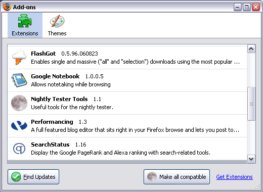
All you have to do is to go and download a wonderful Nightly Tester Tools extension. Not only it is compatible with your newest Firefox version, but it will also add a button to your Extensions manager (Tools->Add-ons):

Just click this button and restart your browser. Please note that this is a screenshot taken AFTER making all the xtensions compatible – so as you can see they’re all active already.

The advantage of this way is that it’s really easy to make all your extensions compatible with any Firefox until Firefox 3.0 (that’s what this extension puts as the MaxVersion for each of the extensions it fixes)

The disadvantage is that there is no equally easy way to revert the changes, so once “made compatible”, your extensions will stay this way – there is no button to make them uncompatible again. However, disabling the extension seems to restore the versions.

2) Making Extensions Compatible – THE FIREFOX GURU WAY

What you can do is open the configuration (about:config) in your Firefox browser, right click the list and create a boolean extensions.checkCompatibility option there. Set its value to false and restart the browser.

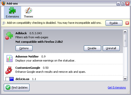
Most of your extensions should work now. If you go to the Add-ons dialog, it will look like this:

As you can see, extensions which would otherwise be incompatible, are flagged with the exclamation mark. You can also see a warning message which suggest you enable the compatibility check again.

The advantage of this approach is that it’s really simple to make the change which affects all the extensions.

The disadvantage is that this way can be used as a temporary solution only, as it may lead to unpredictable consequences (some really old or really new extensions may malfunction).

3) Making Extensions Compatible – THE HARD WAY

This is essentially a manual way of accomplishing the result of using the Nightly Tester Tools extension.

The advantage of this way is in total control over which extensions you’ll hack to become compatible.

The disadvantage is in the fact that every step of this method is rather hard: distinguishing extensions to make sure you’re changing the one you really want, and
manually changing the versions supported.

  1. Close your browser
  2. Go to the folder with all your Firefox extensions:
    C:\Documents and Settings\USER\Application Data\Mozilla\Firefox\Profiles\PROFILE\extensions In this line, USER is to be replaced with your Windows login, and PROFILE will be the name of your Firefox profile (weird looking folder name, usually the only one found in Profiles folder)
  3. You’ll see a list of folders there, 1 folder for each extension. The names of the folders are the unique identifiers for extensions, so they may seem scary at first:
    {34274bf4-1d97-a289-e984-17e546307e4f} – this is the Adblock extension GUID.
  4. Go to any folder, and open the install.rdf file for editing with your favorite clear text editor. Notepad works, but using it will make things even harder cause it doesn’t part rdf files properly. Your choice :) Now back to the business. You need to look for 2 things:
    • name of the extension, to make sure you’re editing the right oneJust look for the em:name, and try to recognize the extension from the description that follows:

      <!– Front End MetaData –>
      <em:name>Adblock</em:name>
      <em:description>Filters ads from web-pages</em:description>
      <em:creator>The Adblock Crew</em:creator>
      <em:contributor>Henrik Aasted Sorensen</em:contributor>

    • a block of minimal and maximum Firefox versions the extension will work on.
      Warning: there could be few similar blocks with versions, so make sure you’ll edit the one which has EXACTLY this em:id, the one which belongs to Firefox browser: ec8030f7-c20a-464f-9b0e-13a3a9e97384.
    • <!– FireFox –>
      <em:targetApplication>
      <Description>
      <em:id>{ec8030f7-c20a-464f-9b0e-13a3a9e97384}</em:id>
      <em:minVersion>0.7</em:minVersion>
      <em:maxVersion>1.5</em:maxVersion>
      </Description>
      </em:targetApplication>

  5. Edit the maxVersion parameter (shown in bold to make it easier), and change it from 1.5 to 2.0b2.
  6. Remove the extensions.cache file from the C:\Documents and Settings\USER\Application Data\Mozilla\Firefox\Profiles\PROFILE\ folder – this will make sure Firefox will read all the changes from install.rdf files and pick up the now “compatible” extension
  7. Restart your browser, enable the previously disabled extension you’ve just edited
  8. Restart your browser again to activate this extension

There you have it. Enjoy!