When Updating Forum Theme Templates

Don’t forget that most of the existing forum engines (phpBB and vBulletin are the ones I use) have some form of internal caching for all the templates. This means that you need to refresh the cache after making any changes.

I’ve just spent a good few minutes trying to figure out why most recent changes to one of my forums never applied, and it seems that although I’ve changed the template files, there was a step with cache refreshes which had to be taken before any change is visible to forum users.

This is a really basic piece of advise, but since it’s not the first time I forget to check for internal caching, I thought I’d share it and save you some time in the future.

WPdesigner Launches the 5$ WordPress Themes Club

WPdesigner Logo

Finally, the 5$ themes club is up and running! Please have a look at the original announcement made on the WPdesigner blog for the full story, but just to get you interested enough I’ll tell you what this club is about: it’s a paid membership community where for just 5$ a year you’re guaranteed to have access to at least 12 unique WordPress themes. Sounds like a sweet deal!

Here are the highlights of the 5$ Themes Club:

  • 5$ a year is all it takes to become a full member
  • No copyrights in the footer (you’re not supposed to claim the authorship of any theme though)
  • You can use any theme on an unlimited number of domains
  • Great preview page listing all the best features (here’s a teaser: the Gossip theme)
  • Free technical support (ticker system or forum)

A Chance to Win Great Prizes @ DavidAirey.com

I’ve just realised that some of you may have never heard about the great blog anniversary at David Airey’s blog, which is accompanied by a fantastic prize draw.

David Airey is a logo designer well known as the creator of some of the best logos on the web. To celebrate his blog’s anniversary, he’s got more than $4,000 worth in free prizes for all of us to win!

As always, there’s a number of ways to participate – subscribing to his RSS or email list is one option, and blogging about it (that’s right, just the way I’m doing now) is another.

There’s still 2 weeks left for you to make up your mind on participating, and the quality and number of prizes is so impressive that I think everyone should give it a try. Let me know if you win anything, and you’re always welcome to thank me for sharing the link to David’s website too :)

PerfectBlogger Website Redesign

Hi everyone, and welcome to our new website!

As some of you can guess, it’s a slight modification of a rather popular Nonzero Red theme. Well, it’s not red anymore – that’s one thing for sure.

I like this new theme much more than previous template, and its flexible design will make adding new features a lot easier.

Please browse around and let me know what you think! If you notice anything strange or wrong, I’ll be sure to fix it as soon as possible.

Creating a theme in WordPress

First off, she's given us a list of useful resources for creating WordPress themes, and then came the actual posts.

So far, there are two posts describing two steps of creating a theme:

  • In this post, Rachel talks about the basics of your new theme layout. Before you get to actually code your WordPress theme, you really need to get absolutely clear about what you want your visitors to see on you blog and why.

    Your layout is supposed to be a well-thought positioning of your blog elements like logo, main menu, actual posts and additional content.


I think this series will prove to be invaluable to anyone who's interested in creating WordPress themes of their own. I personally had never created a theme from a scratch, but have customized a number of them – so it is a good opportunity for me to understand the whole process even better.

Create New Color Schemes With Online Tools

I'm currently working on a new design for my Personal Development Ideas blog, and since I plan to pick a new color scheme for it, I've done some research and found a few excellent online resources to help you find the best color scheme for your design.

Here are the tools I recommend. All of them give you a color scheme as a result, and allow you to copy the hex values of each color:

Color Schemer
It's an online tool from a well-known publisher of the Color Schemer Studio – a software for Windows and MacOS platforms. If you're serious about your new color scheme, you'll probably benefit most from downloading the software, but basic experiments can be simplified with their online tool.

Color Schemer

As you can see, the idea is built around you picking a current color, and then the tool will suggest you matching colors based on its algorithm. Using the "Lighten Scheme" and "Darken Scheme", you can change the contrast of a scheme.

Color Scheme Chooser
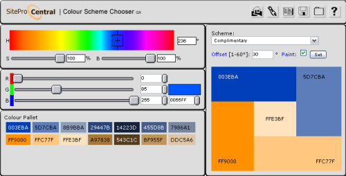
This is a free online tool from SitePro Central. Not only does this tool offer you great functionality, but it is also possible to place the tool on your own webpage using the provided HTML code.

Color Scheme chooser

You can probably see from the screenshot, that this tool offers you even more flexibility in choosing your base color. In addition to this, you get a choice of color scheme definitions, which allows you use the same base color to produce different color schemes – based on analogic, complimentary, split complimentary, triadic and double contrast approaches for picking colors.

Colormatch Redux
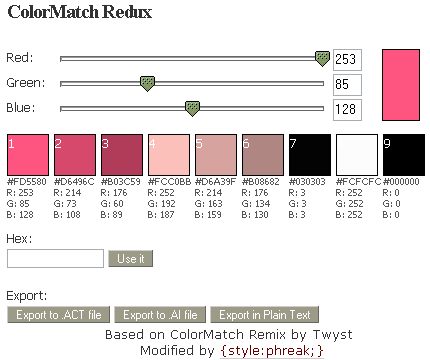
This tool from Style:Phreak, while having probably the simplest interface of all, has pleasantly surprised me by its choice of export options – for example, you can have it export all the colors of a current scheme into a clear text file. But the best export option is to save the scheme as a Photoshop color swatch file. Really handy!

Colormatch Redux

Color Scheme Generator 2
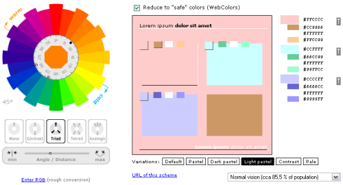
This tool has a very interesting way of picking colors and gives you more precise control of the angle for the tool to pick opposite colors for your scheme. There is also a number of variations available to slightly alter your scheme – Default, Pastel, Dark Pastel, Light Pastel, Constrast and Pale.

 Color Scheme Generator

That's it for today. Hope you find this round-up useful! If you know any more online color scheme tools worth including, please let me know by leaving a comment!

Speedlinking – 14/10/2006

Just thought it's about time I start sharing some of the useful posts I come across during my week.


Here are a few for the past week: 

Rajesh Setty from Life Beyond Code has written a very good article: 10 things they didn't tell you about blogging. Some of the points he made are simply brilliant, for example this one:

You can't get rich blogging.

Again, there are exceptions. Then, you don't include Las Vegas and Lottery in your growth strategy. Do you?

It did make me laugh. Surely, there is a different "rich" definition for every one of us, but in general he's right. It takes a lot of effort and time to get so good in blogging that it pays you enough to live off it. 

It's easy to start but hard to maintain.

In fact, it is VERY hard to maintain. Since most bloggers are not depending on blogging for their living, it is walking an extra mile almost everyday. Plus, how do you motivate yourself to do something that does not have a short-term return?

Again, a very common problem. You've got to be really passionate about your blog's topic, otherwise you will not be able to stay motivated for long enough to see it gain traffic and your readers start commenting and motivate you to write more. 

A few days later, Rajesh had posted another 10 things they didn't tell you about blogging, sharing some more of his experience with us:

Don't write if you don't have anything to write

You know – writers block affects bloggers too. It is REALLY OK to not post anything if you don't have anything valuable to post. Weak posts bring down the average value of your posts. Why take that risk?

The reason that you write should not be because you have a blog but because you have something valuable to contribute.

I totally agree on this one. I'm constantly struggling with myself over days of quietness on my blogs – whenever I don't have enough time to share an idea or some knowledge in a quality article. At first you feel really compelled to post ANYTHING, because your blogs have to appear dynamic and regularly updated. But when you realize that a weak post will have a much more negative impact than no post at all, you eventually learn to be patient.


Chris Pearson shared his observations after his website had finally got out of the Google Sandbox (congratulations!), and compiled a Graphical Look at the Effects of the Google Sandbox:

It really is amazing how powerful Google is in terms of pushing traffic all over the Web. I have literally been wowed by the rate at which my traffic and other metrics have increased over the last two months, which is basically the time frame in which I crawled out of the Google sandbox.

If you're interested in learning more about Google sandbox and ways to get out of it, I have previously posted an article about it, so please have a look: Simple Ways To Get Out Of Google Sandbox.


And last, but certainly not the least, is Paul Scrivens, explaining to some of us Why Your Web App Sucks with well-known examples. And excellent read with some links to other interesting articles from the same Wisdump site:

The reason it is so hard to make a great web application is because it is so easy to make it suck. The greatest ideas do not always translate into the greatest applications because of poor execution.


That should make 10 minutes of your reading today worthwhile. Enjoy!

Feed Button

Feed Button is a service to help you get a cleaner look of your blog sidebar by replacing all the possible ways to subscribe to your feed via various online services like Google Reader, My Yahoo!, Pluck and others with a nice-looking button and a bit of code attached to it.

The idea behind the feed button is that you conserve the precious space by showing only one button, but when your visitor hovers the mouse pointer above the button, it automatically expands to show you all the possible subscription options.

The idea is simple, and I believe any blog which currently has more that 5 feed subscription buttons can probably benefit from using it. All you need to do is give their feed button generator a link to your blog, and your piece of code is going to be provided in just a few seconds, ready for you to copy & paste onto your blog's sidebar code.

Go check it out: FeedButton Beta

Leave Your Comments Open!

Okay, I've seen way too many blogs requiring some kind of registration before you can leave a comment, and I think it's about time I let you know my opinion on this.

I hate it when people require you to register. Unless it's some kind of really busy and popular blog with a proven successful track and long history, there is absolutely no justification whatsoever to make people register just because they want to comment on one of your posts.

To me, low-traffic blogs with required registration or completely closed comments, immediately mean one of the two things about their owners:


  1. Blog owner wants to get something from me for my chance to do him/her a favor

    Naturally, many blog owners have some goals to pursuit. That's totally cool with me, as long as their goals don't enforce anything upon me. For example, I don't mind nicely integrated ads – I understand the desire of a blogger to earn some cash from his online creation, and I respect it. He (usually) doesn't beg me to click on a banner, and he doesn't hide any potentially useful content under the "click me" or "give me your email" page. I have a choice. I feel respected, because I can decide myself whether I want to click somewhere or not.

    And when I see an interesting post and I have some useful information to add, I'm really pleased to see an indicator of open comments – like a number of comments left so far, etc. But when I click the link to leave a comment and see a message asking me to register, I immediately realize: the blogger asks for too much. He may get it from someone else, but not from me.You see, comments are adding value to his blog. By leaving comments, people share their opinion, ask questions and interact in all other possible ways.

    Without comments, a blog looks strange. So, in effect, you're doing the owner of a blog a favor by leaving your comments. So he should be open and grateful to such favors.If, instead, the owner wants me to register – to pick a username and to provide one of my working emails, this immediately makes it obvious that the owner doesn't respect his visitors and commenters at all.

    It is plain wrong to make people give you something personal (like an email) for a chance to do you a favor.If you have been this kind of blogger so far, change your tactics immediately cause you now understand why you are wrong! It's better to disable comments completely than leave them seemingly open but then ask for a registration.

  2. Blog owner is being ignorant and/or lazy

    This is another popular type of blogs and their owners. Many bloggers justify shutting their comments down by mentioning potential spam attacks and overwhelming efforts it's going to take to maintain clean comments and make sure no spam is allowed.

    While this is a serious and quite real problem for many bloggers, there is a number of solutions available, and you don't have to be a rocket scientist to make them work:

    Captchas

    This is the most common way of protecting yourself from spam. Your blog automatically shows some image representing a textual information, and asks commenter for a confirmation of what is shown there.The logic behind this is that most spam is automatic. So if it's a spam bot, it will not likely "see" the textual information on the image, and won't be able to confirm it.

    For human commenters, though, it's going to be quite easy to look at an image and type what they see in a separate field. Thus confirming the human nature of a comment and raising the possibility of a comment to be a real thing and a genuinely useful information.

    Captchas usually show letters in different colours and shapes, so it's fairly hard to automate the recognition of letters on such images. For people it's still quite easy to do this, so captchas are very common and effective.

    Spam word filters

    Looking at spam comments left on your blog, you can probably see the nature of most of them and spot words which contradict the topic of your blog so much that it would be safe to make an association: if a comment contains some specific word, it's likely to be a spam and should not be shown on your pages.

    Many blog engines support such filters and allow you to greatly reduce the number of spam post which get through.

    Automatic spam filters

    One word: Akismet. Speaking of spam protection, this is the greatest thing since sliced bread.

    Akismet is a centralized spam filter, and online engine which allows you to use its vast knowledge base to effectively filter out spam comments.

    You use it by installing a plugin for your blog engine and entering an Akismet API key (get one free at WordPress.com after you sign up for an account there), and it automatically and – very important! – discreetly analyzes all the comments left on your blog, and marks spam ones for your later review. Whenever you log into your administration panel next time, you can see right away how many possible spam posts have been filtered out since your last session.

    I like Akismet a lot, I use it for all my blogs and I enjoy lots of spam filtered out daily on an automatic basis – I hardly do anything about this spam. I log in, glance throgh all the spam, and click the "Delete all" button. That's it! Incredibly useful.

    That being said, your mileage may vary ;) I hear, some people don't like Akismet at all. Oh well, I'm sure they have some alternatives then ;)

 
Valid reasons for closing comments

Like I said at the very top of this article, I get the above mentioned negative impressions ONLY when I see comments turned off on a low-traffic, unpopular blog. But my attitude towards major blogs with comments disabled is different, simply because there is always a chance of them having a genuine valid reason for closing comments. 


Here  are just a few valid reasons for you to close your comments:

  • You are a very popular and busy resource,  and you get lots  of human spam

    This means that automatic ways of spam protection may not be effective enough to save your precious time. If that is the case, a popular enough blog may be throwing hundreds of comments at you daily, and unless the majority of them are valid and valuable opinions, you will likely to just disable comments all together and apologize for this in one of your posts, explaining the situation

  • Your online resource is more than just a blog, and you want visitors to have better ways of exchanging ideas

    This implies that you have a dedicated discussion board setup, where you invite all your visitors to comment on your posts. There are various approaches here, but it's quite popular for large sites to post an article on their blog, and then automatically create a forum discussion thread for any comments.

    Of course, you're going to hit the same spam problems with discussion boards, but the clear advantage of having it separate is that your original content is going to be separate from comments and therefore any comments on your discussion board will not be directly associated with your articles.

  • Your blog is a collective effort, and you encourage people join the community and participate in commenting and article writing

    Again, this is quite a possible scenario – I've seen it few times and it works just fine. But it is very important to highlight such a nature of your resource and make it easy enough for new users to join.

    Encouraging people to join should really go beyond a "Want to leave a comment – give me your email" invitation. Be creative! There's got to be something you can do in return – something people will benefit from by joining your community.

    It could be access to members area of your website or an individual profile page on your website they can link to – but there's got to be something your community members find interesting and valuable to them, if you want them to participate.

  • Your blog is content-oriented, and you're so popular and so good that you have to disable comments to save time for writing

    Believe it or not, this case is as probable and as common as any others – almost every day I notice another promising resource with great content, and some blogs are so popular that it's very easy to believe the choice between answering comments or posting new quality articles is not an easy one.

    If you have some definite indicators that people love your content (many incoming links, solid traffic and thousands of visitors a day), and you notice yourself spending more and more time sorting your email out, it is a decision you're eventually going to have to make – either keep communicating to everyone who leaves a comment, or close your comments and instead concentrate on providing more of the great articles everyone keeps coming back to your blog for.

That's about it. I've been working on this article for a few days, and there's just too many thoughts on the subject.

The message I wanted to give you all is this: leave your comments open unless you have a valid reason for not doing so.  

How To Improve Your Blog Usability And Why You Want To Do It

Usability of your blog is one of the most important factors of how successful and popular it is. Yet, it is often neglected.

Read on to find reasons and motivation for improving the usability of your blog, and once you feel totally convinced, I'll show you some of the best tips to greatly improve your situation, listed along with instructions and links to respective online resources.

What is usability?

Speaking of web, usability is a term used for showing how easy (or hard) it is for your visitors to browse your online resource. Usability applies to all kinds of online resources: it can be a regular website, an electronic library or a personal blog – it doesn't really matter. What matters though is how easy it is for people to move around your collection of resources, and how comfortable you make this experience for them.

In general, usability indicates just how easy it is for people to use a particular tool in order to achieve a certain result. When you project it into the world of blogging, this makes your blog a tool. It is both a tool for you to share the information and for users to receive it. So improving your usability means making both primary uses of your blog a pleasant experience.


Why improve usability at all?

With millions of blogs updated daily, the pressure is growing every day for every one of us to raise the standards of our blogging. Demanding visitors expect increasingly more, and this means that the basic level of usability has to be maintained by every blog, including yours.

Unless you're a selfish genius who writes posts for himself, you would really want to make sure your visitors get what they expect to see when they arrive at your blog, and it's therefore absolutely vital to make them feel comfortable browsing your pages. Especially so, if you hope for some of them to come back to your blog again and again.


How To Improve Your Blog Usability

As with anything else, in order to improve your blog usability you need to find out reasons for doing so. After you understand all the reasons, you can focus on one particularly beneficial usability feature or another. Essentially, you want to define and write down the following:

  1. Your purpose for having a blog

    Why do you blog, really? What are the main goals you have? What is the purpose of your blog?

    You need to ask yourself all these questions to have eventually a list of pretty general goals of your blog, and make sure you can align your blog usability against such a list.

    Here are just a few examples of how you would align your usability improvements against your blogging goals.

    If your blogging goals are:

    • to provide visitors with useful information
    • to develop your skills and knowledge in relevant subjects
    • to gain more readership
    • to participate in blogging community

    …then your usability improvements should be respectively aimed at:

    • both increasing and simplifying ways to access information on your blog pages
    • encouraging your readers to leave comments and provide feedback
    • providing multiple means of reading your blog regularly – RSS feeds and email subscriptions
    • making sure you link to other blogs and get them to link to you
  2. Purposes your visitors might (should) have

    Why should anyone want to read your blog? What would your regular readers keep coming back for? What would a first-time visitor notice or discover first? What would your visitors be looking for?

    These questions are aimed to help you understand what kind of the first impression your blog is going to make. Imagine yourself to be a visitor to your blog. Open it up in your browser and look closely – what do you see first? Is this an important piece of information or just an accidentally highlighted design feature which bears no value?

    Again, here is a list of most obvious reasons you might have:

    • your blog contains genuinely interesting information of educational nature
    • you're an expert in your field, and visitors will come back for more information
    • your visitors are likely to be so interested that they will want to browse your previous articles
    • you are so brilliant that some people will want to read your blog regularly

    And they would mean the following directions in your usability enhancement:

    • highlighting the most recent information, notifying blog search sites about new posts
    • showing a list of most recent posts to make navigation easier
    • providing links to monthly archives of your posts and list of categories of posts
    • making RSS and email subscription options visible


Technical details 

Now that I've got you interested in usability enhancements, I offer you the following list of WordPress articles and plugins which I believe you will find useful:

  1. Blog posts archives pages
    It is very important that you give your visitors an option to access every previous post of yours with just a few clicks. Blog archives pages serve this very purpose.

    Consider using Justin Blanton's Smart Archives plugin, which will provide you with a very quick and effective way of showing your blog archives – with monthly sections and links to every individual post of each month.

    To see this in action, check out Perfect Blogger Archives page.

  2. Category lists

    Most themes for your blog would have a built-in and probably enabled by default functionality of showing a list of your categories somewhere on a sidebar.

    One of the easiest way to increase usability of such lists is to provide a total number of posts found in each of the categories. This will make it easier for your visitors to decide what category to read next, by helping them realize what categories of yours have most posts.

    To achieve this effect (you can probably notice how it looks right here on this blog), you need to use the list_cats function of WordPress:

    <?php list_cats(FALSE, '', 'name',
                            'asc', '', TRUE, FALSE,
                            TRUE, true, FALSE,
                            TRUE, FALSE, '', FALSE,
                            '', '', '',
                            TRue); ?>

  3. Tag cloud
    This is a brilliant way to improve usability of your blog. Effectively, you will allow visitors to pick only specific topics of their interest as oppose to limiting them by your own list of categories.

    Tags are more specific than categories by their nature, so don't be surprised to end up with a long list of tags in your tag cloud.

    The idea of tag cloud is that it's going to highlight (using different font sizes) the most popular tags of yours (the once set for most number of posts), once again highlighting the most talked about topics of yours. The working example is found on this very site on the left sidebar.

    Ultimate Tag Warrior is the best plugin for this purpose. It's rather complicated, but well worth the time it requires to be properly setup.

    If you prefer doing everything yourself, you might like this Building A Tag Cloud in WordPress article.

  4. Blog feeds
    When people like your blog, they usually want to read it regularly. And since the easiest way to do this is by receiving your blog feeds, there is definitely something you can do to make their life easier.First of all, make your feed button (or text link) visible.

    Don't expect people open up a separate window with HTML code of your blog to find the feed link manually (although that's exactly what I do for far too many blogs simply because it's impossible to find their feed button on the page). Most people won't be like me, they will just wonder where your feed subscription might be, decide to come back to your blog, and eventually forget to do it.

    A bright visible feed button is the least you can do for your future readers.

    Another usability improvement here is to install a Feedburner Feed Replacement plugin and get all the various formats of feeds (RSS is only one of them) redirected to your one and only public feed, which you need to configure at FeedBurner.

    Setting your FeedBurner account is easy enough, and having a single blog feed will make your life easier in many ways: not only will FeedBurner automatically show the feed in expected by a client program format (for instance, your feed aggregator might expect your feed in Atom, RSS or RSS 2.0 format, or it could be just a regular browser opening the feed URL – FeedBurner will show a nice looking page with your posts in this case), and most importantly it will allow you to effortlessly track your readership.

    Open this page in your browser to see my FeedBurner feed in HTML: PerfectBlogger.

  5. Comments on your blog

    There is a whole array of various plugins to make your comments management and representation better for you and your readers.

    I suggest you explore the Comments Plugins section on the WordPress development site.

    You can also benefit from reading the Editing your blog comments article by Lorelle on WordPress.

  6. Related posts

    This is another great way of improving usability of your blog.
    By interlinking (providing links to relevant posts of your own blog), you will make visitors stay longer on your blog. You will also help them explore more on the topic of their interest.

    I prefer specifying relevant topics myself, and for this purpose I suggest you use a Terong Related Posts plugin. It simply adds a link to your post editing window in WordPress, and allows you to select the relevant posts from a global list of all the posts. Selected posts will then be given as a neat list of links at the bottom of your post.

    If you would like relevant posts to be identified automatically, you should have a look at a Related Entries plugin by W.A.S.A.B.I. then.


External links

You should find these resources interesting and relevant to this article: